
The point of marketing is to deliver a message. And if you have a message, it’s very likely you’re going to have text – make sure your audience can read it!
One of the most common marketing mistakes we see is copy that’s hard to read because of the background it’s on. Most people instinctively know that dark text is easier to read on light areas…

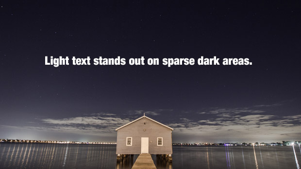
…And light text is easier to read on dark areas.
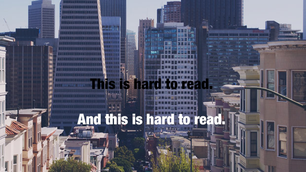
Unfortunately, it usually isn’t that simple. Often times you’ll find yourself working with a complex image that has many colors and areas that are both light and dark. That’s when things get interesting. As you can see below, you have your work cut out for you.
But have no fear, we’ve put together a mini crash-course with 5 easy tips that’ll make your words impossible to miss.
Continue reading below for all the useful info.
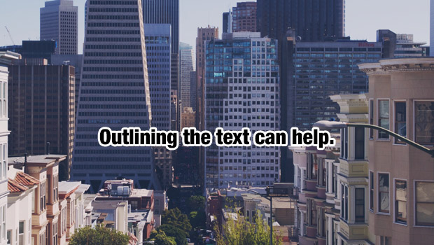
Tip 1 – Outlining
Adding a thick outline to text is essentially fool proof. Once a border is created, it’s a lot easier for our eyes to spot. However, there is a trade-off. An outline isn’t a very subtle solution, and in some cases it can separate the text from the photo in such a way that they begin to seem disparate and unrelated. Still, that’s a small price to pay when it’s the difference between clarity and confusion.
Tip 2 – Shadows are your friend
Similar to outlining, shadows have the added benefit of creating 3-dimensional depth. You won’t have the separation issue I mentioned before, because if the text is casting a shadow on the photo, they’ll feel connected. It’s as if the copy and the image are existing in the same physical place.

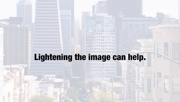
Tip 3 – Lighten up
When in doubt, make it brighter. If you lighten all of the colors and push them towards being white, you’re creating more contrast with the black text on top. More contrast means more clarity. This trick is powerful but limited in application. It’s great for backgrounds, but you should use another method if your image is something you want your audience to have a clear view of.
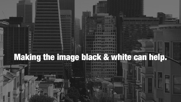
Tip 4 – Things aren’t always black and white.
(But maybe they should be)
This is one of my favorite tricks. It’s simple and the result is often elegant and evocative. Let’s deal with the obvious downside first – you’re sacrificing color. However, what you’re getting in return is crystal-clear clarity. Once the brain doesn’t have to process color anymore, it can hone right in on the text. Want your text to really pop? Make it a bright color.
Tip 5 – Blurry isn’t bad
Here’s another devilishly simple way to boost the readability of your text – blur the background. Blurring makes everything smoother, and crisp solid lines of text tend to stand out when they’re on top of softer areas. The benefit with the blur method is you can still have a colorful background. However, like the lightening method, there is a slight loss of image information and fidelity.

As you can see, there’s many ways to ensure your message stands out. Not every technique will work in every situation, but the important thing is you now have a toolbox and (hopefully) a better understanding of how this all works. I’d encourage you to experiment. Mix and match these methods, or come up with your own altogether. If you have any tips and tricks, we’d love to hear them in the comments below.