5 Tips & Tricks for Adding Text To Images

The point of marketing is to deliver a message. And if you have a message, it’s very likely you’re going to have text – make sure your audience can read it!

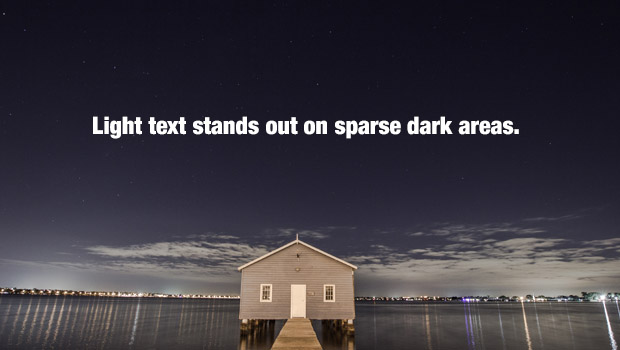
One of the most common marketing mistakes we see is copy that’s hard to read because of the background it’s on. Most people instinctively know that dark text is easier to read on light areas…

exam-1

…And light text is easier to read on dark areas.

exam-2


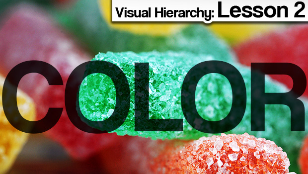
Unfortunately, it usually isn’t that simple. Often times you’ll find yourself working with a complex image that has many colors and areas that are both light and dark. That’s when things get interesting. As you can see below, you have your work cut out for you.

exam-hard

But have no fear, we’ve put together a mini crash-course with 5 easy tips that’ll make your words impossible to miss.

Continue reading below for all the useful info.

Continue reading

10 Best Free Stock Photo Sites You Never Knew About

When it comes to design, great stock photos make a huge difference. Unfortunately, great stock photos usually come with a huge price tag as well.

But guess what? Today’s your lucky day. We’ve scoured the internet and found 10 incredible treasure troves of free high quality stock images. They’re yours for the taking, and they won’t cost you a dime. Just be sure to check the fine print, because every site is a little different and some may require attribution depending on how you use them.

—-

1. Unsplash

Why it rocks:

Unsplash adds 10 new images every 10 days, and while the subject matter varies, one thing’s always the same – they’re absolutely stunning. The best part is you can use the images however you want. There’s zero restrictions.

10


2. Stock Vault

Why it rocks:

Stock Vault has all sorts of images and design elements, including textures and backgrounds. What’s cool about Stock Vault is you can see their most popular and most downloaded items. It’s a great way to put your finger on the pulse of the design community.

9


Continue reading

Visual Hierarchy Lesson 4: Whip Your Designs Into Shape

In our fourth and final look at the visual hierarchy of design, we’ll be examining shape. Shape is a relatively intuitive concept because our minds are already trained to break things down to their most basic forms. Many of us grew up playing with blocks and other geometric toys, and we see shapes every day – from octagonal road signs, to square windows and doors. It’s this deeply ingrained familiarity that makes shape such a powerful component of design.

I’ve already discussed some of these concepts in the alignment section, but it’s worth repeating:

Diagonals tend to create a sense of movement and activity.

example1

…As do curvy unpredictable lines.

example-4

Continue reading