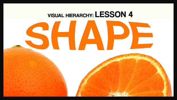
In our fourth and final look at the visual hierarchy of design, we’ll be examining shape. Shape is a relatively intuitive concept because our minds are already trained to break things down to their most basic forms. Many of us grew up playing with blocks and other geometric toys, and we see shapes every day – from octagonal road signs, to square windows and doors. It’s this deeply ingrained familiarity that makes shape such a powerful component of design.
I’ve already discussed some of these concepts in the alignment section, but it’s worth repeating:
Diagonals tend to create a sense of movement and activity.
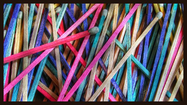
…As do curvy unpredictable lines.
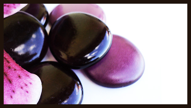
However curves that are predictable, like circular shapes, tend to feel tranquil and at rest.
…As do purely horizontal lines.
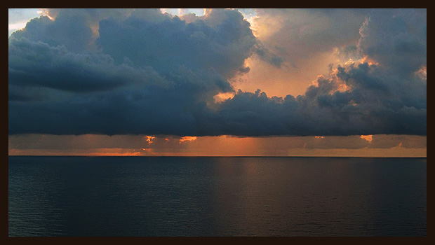
The reason we experience sensations of either stillness or energetic movement with these photos is because our mind is constantly trying to fill in the blanks. In the skyline above, you can easily imagine the picture extending outwards to the left and right. It’s this ease of understanding that creates a sense of calmness. We don’t expect it to do anything unpredictable, so our brains relax.
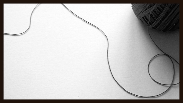
It’s a lot more challenging to imagine what the windy ball of yarn would look like if it kept going. There’s no true rhyme or reason to the way the string is positioned. Therefore it takes a lot more mental energy to imagine it extending outwards.
We love predictability. In nature, predictability means safety. Once we know what something is and how it behaves, it’s easier for us to ignore it so we can focus on other things. The same idea applies to design. When we want something to stand out, or when we want the viewer’s eyes to travel, it’s best to resort to unpredictable and unconventional shapes.
When we want something to stand out, or when we want the viewer’s eyes to travel, it’s best to resort to unpredictable and unconventional shapes.
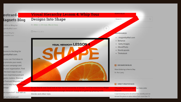
We can see how these “rest” and “movement” concepts apply to design by examining the image below. People tend to read things, especially webpages, in a Z-pattern. Savvy designers have exploited this phenomena by designing content that fits the mold. Notice how we start with the headline, move to the large image, and then continue on to the copy.
Shape, like all the other components of visual hierarchy, is really just a tool to create contrast. Design is all about deciding when to distinguish and when unify, when to draw attention and when to create harmony. The more similar your shapes are, the more cohesive the design will feel. When a shape is different than all of the others, it will feel more important and prominent. Be aware of where you’re directing the viewers attention. And as always, don’t be afraid to think outside the box.
I hope you’ve found this series helpful. Be sure to check out the previous entries on size ,color, and alignment if you haven’t already. And if you have any questions, feel free to leave a comment below.