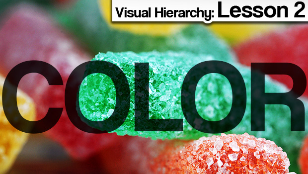
Last week we discussed the importance of size. As promised, this week we’ll be focusing on color. Color is one of the most powerful tools in the design arsenal. It’s the difference between beautiful and garish. It can make things blend in, or stand out. It even has the power to affect our mood.
This lesson will be mostly visual. Below is our first example.
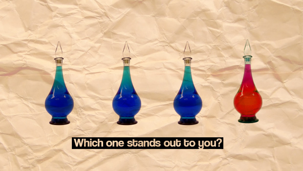
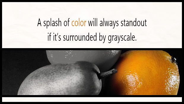
Easy, right? The red one. Our mind is programmed to group things together. We like to differentiate, it’s how we filter the constant stream of information we’re exposed to every day. A practical application of this example would be if you had text you wanted someone to absolutely see, such as a warning, a headline, or an offer.
Our mind is programmed to group things together. We like to differentiate, it’s how we filter the constant stream of information we’re exposed to every day.
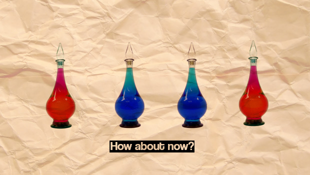
Things are getting interesting. Which color stands out? Red? Blue? It’s a trick question. They’re equally balanced. If a color stands out to you here, it’s probably a matter of personal preference. Balanced colors like this can be useful for website layouts or packaging. They won’t necessarily make something stand out as more important, but it’s a great way to separate content into sections.
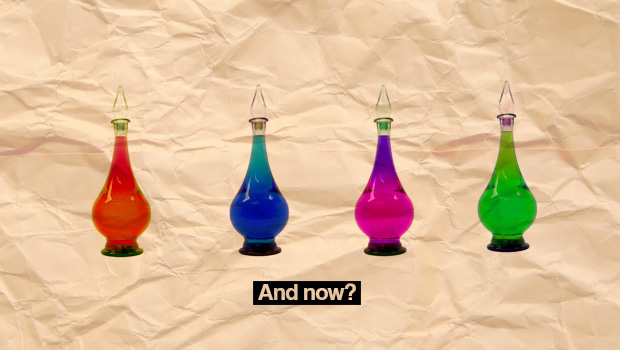
Okay, you know the drill by now. Which color stands out? If you said none of them, you’re catching on. In a purely visual sense, this image may be interesting and nice to look at. However, as far as being used an organizational tool, there’s too many colors here. There’s nothing for us to group together, it’s just four pieces of separate information. Am I saying you should never use lots of colorful text or images? Of course not. Just be cautious, and realize that the more colors you use, the less impact they’re going to have.
Another interesting thing to note about color is when something is lighter, we tend to think of it as far away. We give darker objects more of our attention because subconsciously they feel closer and more immediate.

That’s why you’re drawn to the darker bottle on the right, and it’s one of the reasons we use lots black ink. You may not always want to standout. If you’re designing something that needs to feature information that could dissuade potential customers, it’s a great benefit to have an understanding of color. For example, it probably makes more sense for terms and conditions apply to be a muted gray instead of bright attention-grabbing florescent green. Which brings me to another somewhat obvious but still worth mentioning point…
Countless books have been written on the topic of color and artists spend decades trying to master it, so you’re obviously not going to learn everything there is to know from one blog post. I highly encourage you to seek out more information if you’re interested and I hope you found this primer helpful. The most important thing to remember is that with color, less is pretty much always more.

Next week we’ll be looking at alignment, and the surprising benefits of being a little disorderly.