5 Tips & Tricks for Adding Text To Images

The point of marketing is to deliver a message. And if you have a message, it’s very likely you’re going to have text – make sure your audience can read it!

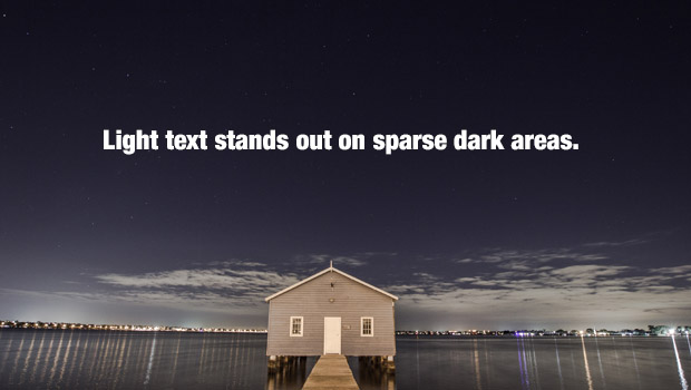
One of the most common marketing mistakes we see is copy that’s hard to read because of the background it’s on. Most people instinctively know that dark text is easier to read on light areas…

exam-1

…And light text is easier to read on dark areas.

exam-2


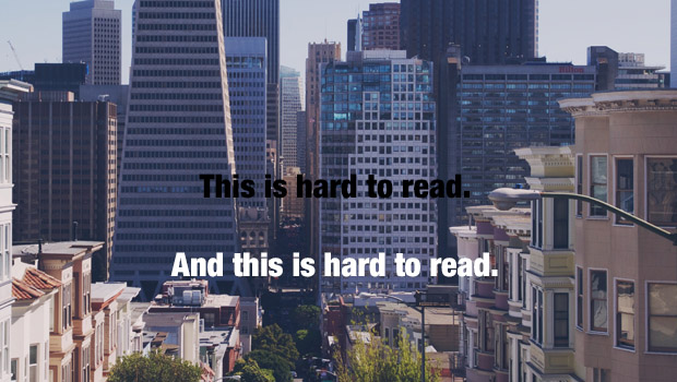
Unfortunately, it usually isn’t that simple. Often times you’ll find yourself working with a complex image that has many colors and areas that are both light and dark. That’s when things get interesting. As you can see below, you have your work cut out for you.

exam-hard

But have no fear, we’ve put together a mini crash-course with 5 easy tips that’ll make your words impossible to miss.

Continue reading below for all the useful info.

Continue reading

10 Best Free Stock Photo Sites You Never Knew About

When it comes to design, great stock photos make a huge difference. Unfortunately, great stock photos usually come with a huge price tag as well.

But guess what? Today’s your lucky day. We’ve scoured the internet and found 10 incredible treasure troves of free high quality stock images. They’re yours for the taking, and they won’t cost you a dime. Just be sure to check the fine print, because every site is a little different and some may require attribution depending on how you use them.

—-

1. Unsplash

Why it rocks:

Unsplash adds 10 new images every 10 days, and while the subject matter varies, one thing’s always the same – they’re absolutely stunning. The best part is you can use the images however you want. There’s zero restrictions.

10


2. Stock Vault

Why it rocks:

Stock Vault has all sorts of images and design elements, including textures and backgrounds. What’s cool about Stock Vault is you can see their most popular and most downloaded items. It’s a great way to put your finger on the pulse of the design community.

9


Continue reading

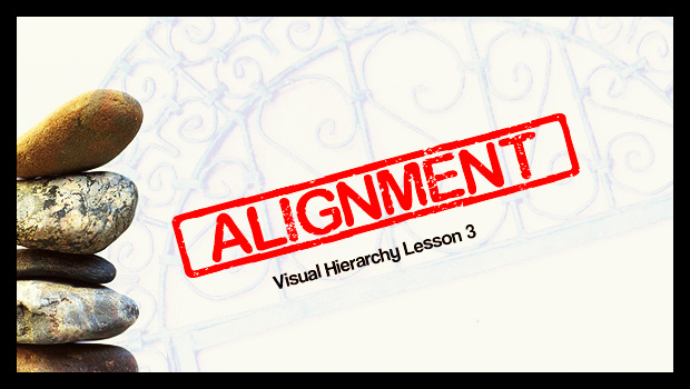
Visual Hierarchy Lesson 3: Here’s Some Straight Talk About Alignment

We’ve been talking about the visual hierarchy of design, and so far we’ve covered size and color. This week we’ll be looking at alignment. Alignment is essentially a method of arranging text or shapes in such a way that they’re aesthetically pleasing while also being easy to understand from an organizational standpoint. Imagine ten people standing in line. If someone stepped to the side, you’d notice them right away. The same rule applies to paragraphs. So far you’ve read several lines of text. If all of a sudden a line of text was centered…

You’d notice that line. It stands out.

That’s because humans like structure and stability, and almost everything in our daily lives reflects this. Our square houses are filled with box-like rooms. Our streets are made up of grids. Our newspapers are compromised of countless columns. We like square and rectangular shapes because they’re predictable and easy to understand. Straight lines tend to feel at rest, while squiggles and curves feel like they’re in motion. Continue reading

USPS NCOA Requirement

Photography by Chris Woods

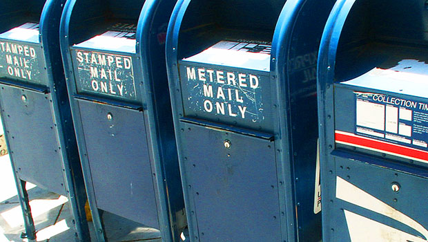
In return for the discount postage rates it offers for First Class Presort and Standard Mail services, the USPS requires that both of these types of mail meet its Move Update standards. This is also called the NCOA processing requirement.

USPS NCOA processingThe Postal Service maintains a sizable registry of people and organizations who have recently moved; and it compiles this info in its National Change of Address (NCOA) database. Mailings that meet the Move Update standard must be checked against the NCOA database, and updated for any address changes.

This is good for mailers, since it helps ensure that addresses are up-to-date. And it’s good for the Post Office, since it minimizes the expense of handling all those bad addresses.

The downside to the NCOA requirement is that it costs money. And for a small mailer with a small list, an NCOA processing fee can seem just plain silly.

Luckily, the USPS provides two ways to avoid the NCOA requirement: Continue reading

Improving Direct Mail

photo by Nick Bradsworth www.nbphotos.net/

OK, the secret is out: the most important factor in getting better direct mail results is improving the quality of your mailing list.

This may not seem that surprising. If you’re using really good criteria to select your mailing list, certainly you would expect improved results.

usps standardized addresses

But a quality mailing list is more than the criteria you use to create it. It is quality content in terms of accurate names and deliverable addresses.

At magnetbyMail, we see hundreds of mailing lists each year — most of them are created by our customers who send them to us. They are usually lists of alumnus, subscribers, members, prospects or clients.

And many of these lists are full of errors that would cause the Post Office all sorts of delivery problems.

Now, the good news is that we’ll do our best to make the addresses deliverable. We’ll try to normalize and validate each address provided, so that it meets US Postal standards and matches an address that really exists.

But (although we try) we can’t do miracles. If you manage a mailing list of any size, you should understand some things about Normalizing and Validating an address, to ensure that your list is in tip-top shape:

Normalizing an Address

The Post Office wants to see addresses in a certain, normalized way. They expect an address with at least three lines of information: 1) Recipient Line, 2) Delivery Line address and 3) Last Line. For example: Continue reading

Sending Large Files

Photography by Andreas Krappweis - http://www.krappweis.com/

How to Send Large Files for Free
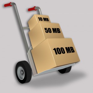
Sending Large Files for FreeBeautiful art files can cause ugly problems when sent through email. The problem is their size.  Many email services restrict the sizes of file attachments, and so emails with big files can simply get bounced back.

But there are a few ways around this problem.  Here are some free large file transfer ideas you might find useful:

  • use an email service that allows big files to be sent. Google allows 25MB files and Yahoo allows 20MB files. Also, the recipient needs to be using a service that allows receipt of large emails.
  • if you have your own website, upload the large file to a folder on your website, then email the link of that file to the recipient. When the recipient has downloaded it, you can delete the online file.
  • you can sign up for a free online file sharing service. Look at SugarSync which offers 5GB of free online storage, as well as a handy routine for backing up your important files. Or consider DropBox which works like a file folder that automatically syncs on all your computers.  With these file sharing services you can upload your files and share them with one or more people.
  • use a free large file-transfer email service that takes care of everything — creates an email, attaches the files you need, sends the email.

The last of the above list is the most popular solution, since it takes care of the email and the attachment.  Here are several services that offer a free version:

YouSendIt   – transmit up to 100MB file, one file per email, Lite version for free.
WeTransfer  – a very easy process with no registration.  Email with one or more files attached, up to 2GB total, for free
DropSend    – email with one or more files attached, up to 2GB total, for free with the Lite version
TransferBigFiles  – with one or more files attached, up to 100MB total, for free.

Each of these services, although very similar on the surface, offer various ‘features’ that make each somewhat unique. Features include: size of the attachments, number of attachments, number of days that a shared file can be accessed, confirmation of email delivery, number of emails per month, and ads or promotional emails you might receive.

Because our work on postcard magnets commonly requires our clients to send large art and data files, we’re always on the lookout for good solutions for large file transfer.  If you have experience with a useful system not mentioned here, please let us know.

Another useful tidbit from your favorite source of magnet mailers, at magnetbyMail.com
Good photography


Photos.com Royalty-Free Photos by Subscription
If you’re going to invest money (, time and effort) in a postcard mailer campaign, you should make sure your layout and design looks its best.

If you need good photo images to help convey your message, you should look through .

At Photos.com, you’ll find stock photography that is all shapes and sizes.  At least one of the images is bound to be perfect for your project.

Oh, and prices are very reasonable, too.  There are plenty of great images available for under US$10.

Images at Photos.comImportant note: make sure you obtain high-resolution photos.  For print quality, its good to have images that are at least 200 Dots Per Inch (DPI) resolution.  Images intended for the web can have much less (72 DPI), so don’t download an image intended for a website.
Also, based on my own experience buying an image at Photos.com, I suggest you first, set yourself as a site user, then add the image(s) into your online ‘lightbox’, and then pay for them with your creditcard. Doing this in an other order can become frustrating.  At least that’s my experience.

I do recommend regardless of the abovementioned quirky checkout process.  Pricing seems to be better than iStockPhoto.com .

Just our 2 cents, from magnetbyMail.com

ideas for layouts

Need some quality, ready-made art templates for your magnet mailer design?

Check out graphicriver.net for complete design layouts by world-class  artists.

graphicriver.net design templatesFiles generally include high-resolution images, and Adobe Illustrator or  Adobe InDesign elements, and suggestions for font files.

Its most everything you need for camera-ready artwork.  You may need to tweak the layout size to fit a postcard.  And of course, you’ll need to write your own copy…

The best way to use graphicriver.net is to browse through the templates.  Even of you don’t buy anything, you’ll be inspired with plenty of design ideas.  And if you do buy something, you’ll be surprised at the low prices.

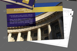
Postcard Sample Template from graphicriver.netFor example, check out this collection of card and brochure designs by jahimmyess.  There are plenty to choose from, you can change colors based on your palette, you receive templates for postcards, brochures, forms, and business cards.  And the download will cost less than US$10.

Now that’s impressive!

Our recommended resource for design templates:  www.graphicriver.net