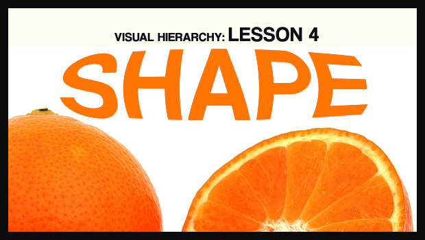
In our fourth and final look at the visual hierarchy of design, we’ll be examining shape. Shape is a relatively intuitive concept because our minds are already trained to break things down to their most basic forms. Many of us grew up playing with blocks and other geometric toys, and we see shapes every day – from octagonal road signs, to square windows and doors. It’s this deeply ingrained familiarity that makes shape such a powerful component of design.
I’ve already discussed some of these concepts in the alignment section, but it’s worth repeating:
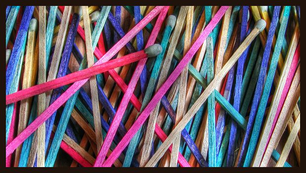
Diagonals tend to create a sense of movement and activity.
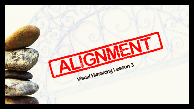
We’ve been talking about the visual hierarchy of design, and so far we’ve covered size and color. This week we’ll be looking at alignment. Alignment is essentially a method of arranging text or shapes in such a way that they’re aesthetically pleasing while also being easy to understand from an organizational standpoint. Imagine ten people standing in line. If someone stepped to the side, you’d notice them right away. The same rule applies to paragraphs. So far you’ve read several lines of text. If all of a sudden a line of text was centered…
You’d notice that line. It stands out.
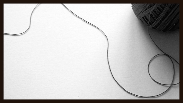
That’s because humans like structure and stability, and almost everything in our daily lives reflects this. Our square houses are filled with box-like rooms. Our streets are made up of grids. Our newspapers are compromised of countless columns. We like square and rectangular shapes because they’re predictable and easy to understand. Straight lines tend to feel at rest, while squiggles and curves feel like they’re in motion. Continue reading
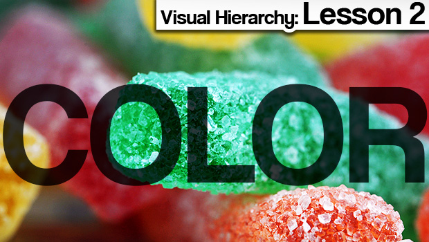
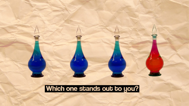
Last week we discussed the importance of size. As promised, this week we’ll be focusing on color. Color is one of the most powerful tools in the design arsenal. It’s the difference between beautiful and garish. It can make things blend in, or stand out. It even has the power to affect our mood.
This lesson will be mostly visual. Below is our first example.
The key to successful marketing is successful communication. Of course, the words and images you choose are important, but did you know how you display them is just as vital?
In a series of blog posts I’ll be exploring a concept known as the visual hierarchy. Simply put, it’s how we make people see what we want them to see, and in the order we want them to see it in. And we do this by understanding and applying the four main components: size, color, alignment, and shape.
it’s how we make people see what we want them to see, and in the order we want them to see it in.
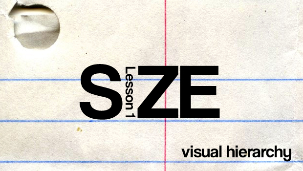
Today we’ll be talking about size, the most frequently utilized and easiest to understand principle. Headlines in newspapers are a prime example. They’re big and designed to grab your attention. Think about the countless advertisements you’ve seen where FREE is the largest text on the page. There’s a reason for that… they know you’re going to see it, and with any luck, respond.
There’s a reason Super Bowl commercials are funny, and there’s a reason they cost millions of dollars: Witty works. Humor had long been an effective tool in an advertiser’s arsenal, and no matter how daring or risqué an ad was, it always had a concrete connection to the product or brand. The punchline was tied to the messaging. Now? Now things are starting to change.
If you’ve been watching television, reading magazines, or surfing the web, you may have noticed a trend – advertising is getting a little weird.
Okay, scratch that. Advertising is getting very weird. But why?
Well first of all, advertisers are becoming aware of the power of social media and sharing. Viral is their new favorite word. And for good reason: a well-executed campaign can yield millions of impressions, now and for years to come, and at no additional cost.
However, execution is tricky because consumers are not easily tricked. They’re bombarded by advertising more than ever, and as a result they’ve developed natural defenses. They’re tuning out, changing channels, and filtering e-mails. If it smells like a pitch or looks like a promotion, their eyes glaze over and they look the other way.
It’s these factors that have created the perfect storm for the odd and unusual. Marketers are minimizing the what, as in what they’re selling, in favor of maximizing the what? As in what the heck was that, I have to show my friends. It’s hard to ignore the people that are important to us, which is precisely why advertisers are so keen on using them.
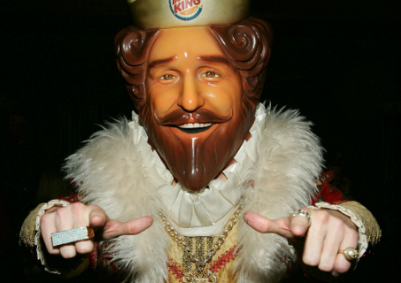
Remember The King? The creepy Burger King mascot that tormented us from 2004-2011? He was arguably the start of all this madness. And while creeping out your hungry customers hardly seems like the best idea, here’s the thing… it worked. People were talking about him, people dressed up like him for Halloween, The Simpsons spoofed him, and most importantly – Burger King profited.
He didn’t look like a fast-food ad. He wasn’t the perfect mouthwatering burger being grilled in slow motion, he wasn’t a waterfall of cola cascading over idyllic ice cubes, he wasn’t the imagery pretty much every other fast-food joint was using. He wasn’t a coupon or an offer. He was just…weird. The perfect thing for people to talk about around the water cooler without feeling like corporate shills. He was so intentionally disconnected from the product and typical messaging that Burger King was able to penetrate the average consumers’ defenses.
The creepy king was a carefully crafted promotional Trojan Horse.
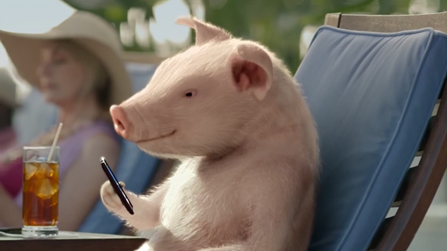
And there’s countless examples of this strategy. Geico television commercials frequently feature short nonsensical skits that have next to nothing to do with their actual product. A pig at a football stadium? Really? GoDaddy has also switched from sexy and provocative to surreal and head scratching.
Best of all, this approach isn’t limited to video. Print ads can be just as odd. The key is to be memorable, and to have your brand somewhere on the page or the screen so they’ll always associate your brand with that memory. That’s it.
So as you develop your marketing strategy, consider doing something a little out there. No risk, no reward, right?
I’ll leave you with one of the strangest and most unnerving commercials I’ve ever seen. An advertisement for Totino’s Pizza Rolls that’s nearing 1,000,000 views. From mere word of mouth.
Do I want Totino’s after seeing that? I’m… I’m not sure. Am I ever going to forget the name?
There’s a new business model that’s finding its way into almost every community: the walk-in urgent care clinic.
Today there are over 8700 urgent care centers in the US alone, according to the profession’s association.
And since urgent care clinics are usually small, local and privately owned, they are much more entrepreneurial than their big hospital counterparts. Where a non-profit hospital might be able to get along with minimal outreach efforts, an urgent care clinic couldn’t survive if the community didn’t use its services.
For the doctors who run these centers, effective urgent care marketing can be the difference between withering or prospering.
As anyone who’s been involved with a neighborhood business knows, there’s a short list of effective ways to build awareness in a community. But attending Rotary Club functions, co-sponsoring soccer car washes, and managing the chamber of commerce open house will only get you so far.
Sure, there’s something to be said for making an investment to assure a prominent spot in Google, under “local urgent care.” But even the all-powerful Google Search would likely not connect with most potential patients when it was time for urgent care.
What the urgent care doctor needs is the clinic’s phone number, street address, and maybe a web address, to be posted in kitchens and workplaces throughout the community.
The clinic could really use imprinted magnets in those homes and offices.
You see, our postcard magnet mailer is a jumbo, full-color, laminated postcard, with a magnet attached. We mail them to a mailing list you provide.
Think of it as a delivery-vehicle with a mini billboard that finds its way into the kitchen or workplace, for the cost of a postage stamp.
And done effectively, the magnet positions the urgent care clinic’s message in full view, for weeks, months or longer, for less than the price of an iced tea.
At magnetbyMail we handle the details: printing, laminating, assembling, addressing, bundling and even the postal paperwork. We can even help with the design and the mailing list.
This leaves more time for the clinic to tend to its patients.
And even though we’re a bit biased about our love for these magnet mailers, we think you could might come to agree that it’s pretty much the vitamin C of direct mail marketing.
Another practical marketing idea from magnetbyMail.com, where healthy results are what it’s all about.
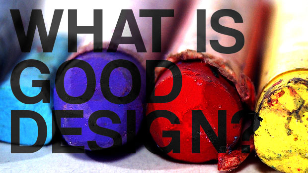
What is good design, exactly, when it comes to direct mail marketing?
The short answer is: the design that achieves the results you need.
And with that you’ll note good design is above all, results-oriented. The entire reason for good design is, not to make the world a prettier place, but to maximize the impact of the message.
The longer answer is more helpful perhaps, although no more precise: good design is using visual elements of form — space, lines, shapes, color and textures, along with function — a compelling message — that achieves an action or some goal for the marketer. Often, it’s about finding an appealing balance between form and function — that is, a pleasing presentation; but this is not always the case.
There’s no single design that is the perfect design. Further, a design that works for one type of message may not work for another.
And a design for one audience may not work for another.
When it comes to postcard magnet mailers (what we do at magnetbyMail) we’ve seen all types of designs for all types of messages and audiences.
The designs that work best seem to be the ones that:
get your attention, either through imagery, a few words, or both;
draw you in to explore and learn more details;
change your emotional state — make you angry, curious, intrigued, excited, etc.;
and lead you to a next step — to a website, a phone #, a donation, etc.
Personally, I like simple layouts. Grab the attention, give a message that’s succinct, and ask for action.
The design philosophy for this is “less is more.” The principle is that unessential elements are distractions. So if an element isn’t necessary to your core message, consider doing without it.
Where do you find good ideas for good design? I suggest starting on the Web.
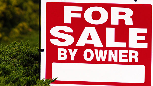
Sure, the real estate market is tough. Nevertheless, with proper pricing and good real estate marketing, properties are still selling.
According to Bloomberg, realtors are selling over 4.5 million units of US existing homes per year.
Based on the average home being sold for about $150,000 (Real Estate ABC), that’s $675,000,000,000 in sales total, just for existing residential properties.
And it’s no secret. Every good real estate agent knows the keys to selling real estate in 2012:
Pricing it right
Property looks its best
Seller is flexible — it is a buyers’ market afterall
and also, you should be
Web savvy
Now, considering 90% of properties are being sold by agents who already know about these four keys, what can an agent do to make his/her properties stand out from the rest?
The answer is: mail a folding postcard with magnet.
And if your response to that is ‘What?’, well let us tell you. (You see, we happen to make these.)
Our Foldup Magnet Mailer is a large 8-1/2″ x 11″ postcard folded in half, with a large 3-1/2″ x 4″ magnet inserted inside. The card is sealed with easy-peel glue, inkjet addressed on front, and mailed by the US Post Office to your prospect list or a direct mail list we can provide.
The postcard can be printed with all sorts of useful info, including color photos of homes for sale and listings in the area. The magnet typically includes your photo, contact info, website address and facebook url.
The Foldup Magnet Mailer makes a double impact: one, when it is received in the mail, and another when the magnet is applied to your prospect’s fridge or file cabinet.
The true power of the Foldup Magnet Mailer is in the distribution. Our experience shows that you should target your own community. You’ll likely gain more listings for yourself and you’ll be creating an invaluable network of neighbors who can become your Facebook friends and a great source for leads.
And you’ll have accomplished a nearly impossible feat: getting people to focus more than 2 seconds on the properties that you’re marketing.
The entire Foldup Magnet Mailer costs less than a dollar (1000 are 64 cents each). It provides you a high-impact presentation in the short term, and an effective way to keep your message in front for weeks, months or longer.
So be a part of that $675,000,000,000 in real estate sales, and kickstart your real estate marketing with a foldup magnet mailer.
Another service from magnetbyMail, doing our part to help promote the economy.
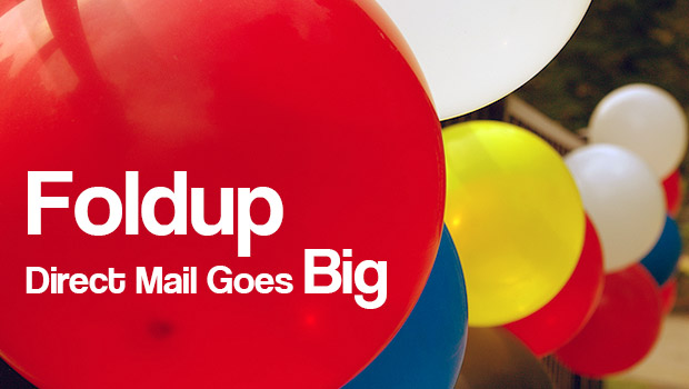
Late last year we asked potential customers looking at our products what they wished for.
They said, as much as they liked the idea of our postcard magnets, what they really wished for was more room to express themselves.
You see, we’ve always had our basic postcard magnets — these are jumbo postcards and custom printed magnets, one glued to the other and mailed via directmail.
But the Venti, our largest postcard magnet at 5-1/2″ x 10-1/2″ just wasn’t enough. Some marketers want more than the Venti’s 115 square inches.
So in January, we introduced our Foldup Magnet Mailer. This a very big, 8-1/2″ x 11″ postcard, folded in half, a magnet attached to the inside, and sealed shut with easy-peel glue. Marketers now can have over 200 square inches of printing area.
The fold provides lots of benefits. The standard postcard format has two sides or ‘facings.’ But the Foldup Magnet Mailer has three facings: the front, the back, and the inside. This gives marketers more space and flexibility to develop their message.
Another benefit of the Foldup is, because the folded piece is thicker than our regular magnet mailer, and the magnet is held securely inside, we don’t need to use poly laminate to keep the mailer as rigid for mailing purposes.
Saving poly laminate saves time and reduces costs. (We still provide a UV coating for shine and protection.)
Our customers can receive a Foldup Magnet Mailer for about the same price as our smaller postcard magnet.
A final benefit is that we can enclose custom shaped magnets with the Foldup. (Our standard postcard magnets could use only rectangle shapes, mostly.)
Foldup Magnet Mailers make sense for any marketer who wants all the benefits of delivering a magnet to a home or office, but who needs lots of space to convey their message.
One thing we should mention for designers: the positioning of the Foldup’s magnet is more restrictive than for our regular postcard magnets. The magnet needs to be attached on the ‘inside’ of the folded postcard, and ‘behind’ the area where the mailing address is to printed.
But if your design can work with that location, the Foldup Magnet Mailer may be the perfect way to deliver your message. You can deliver it with a 200 square inch format, and provide a custom magnet to help keep your message in full view for weeks or months.
Another innovative marketing device from your friends at magnetbyMail.com, your source for magnet mailers and other ingenious communications tools.
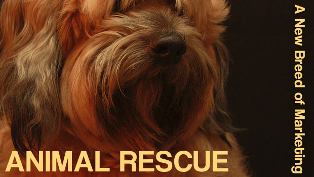
It’s startling to find out how many dogs and cats are rescued from our streets. According to the Humane Society, there are 6-8 million dogs and cats in animal shelters each year, in the US alone.
Each one of these animals needs to find a home. And many new organizations have sprung up to take on the challenge.
These groups don’t necessarily call themselves marketers, but that’s exactly what they are.
Their mission is to raise the awareness of the abandoned animal issue, recruit likely adoptee families, match animals with new owners, promote best practices to the community, and even sponsor legislation that helps save animals.
The animal rescue groups of today use many of the same cutting edge marketing strategies you might find in any major business, using social media like Facebook and Twitter to broadcast rescue news to thousands.
But because not everybody subscribes to their Twitter feeds, these groups have found they need to use traditional media.
And that’s where we come in.
You see, we make postcard magnet mailers. That’s a custom-printed, jumbo postcard and a magnet, one glued to the other, and mailed to a mailing list via the post office.
These magnet mailers are one of the most effective ways for rescue groups to get their message out: to ask people to consider adopting an animal in need.
Our Foldup Magnet Mailer is good for helping tell a more complete story — it’s designed with the magnet attached inside a large, folded postcard, and provides over a hundred square inches of space for text and pictures.
So how does the whole thing work exactly? Simple: the Foldup Magnet Mailer reaches the family through the mailbox. It will likely be opened and read, and maybe discussed. The magnet will be added to a file cabinet or refrigerator, working as a mini billboard for on-going awareness.
Then, one day, the Forces of Good will converge and the family will decide that they’re interested in learning more about adopting an animal and will find the rescue group’s web address on the magnet.
It sounds like great fiction but this process is really what happens every single day.
In fact, there aren’t many other ways for an animal rescue organization to get so much exposure, for so few dollars (…cents, actually).
It might take three or four months for a family to reach that magic moment, and decide to adopt a pet. The Foldup Magnet Mailer provides all the right ingredients to facilitate that multi-month process, and help keep the rescue’s message at top of mind.
Of course, you don’t need to be rescued to benefit from our postcard magnet mailers. You just need to be interested in getting your message out, and keeping it there.
Another timely message (we hope) from your friends at magnetbyMail.com , your source for of postcard magnets and other neat promotional devices.