The key to successful marketing is successful communication. Of course, the words and images you choose are important, but did you know how you display them is just as vital?
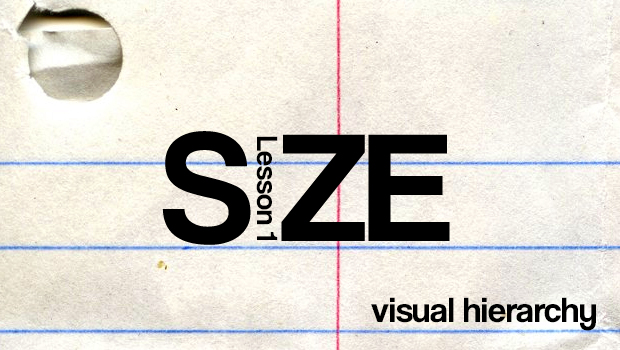
In a series of blog posts I’ll be exploring a concept known as the visual hierarchy. Simply put, it’s how we make people see what we want them to see, and in the order we want them to see it in. And we do this by understanding and applying the four main components: size, color, alignment, and shape.
it’s how we make people see what we want them to see, and in the order we want them to see it in.
Today we’ll be talking about size, the most frequently utilized and easiest to understand principle. Headlines in newspapers are a prime example. They’re big and designed to grab your attention. Think about the countless advertisements you’ve seen where FREE is the largest text on the page. There’s a reason for that… they know you’re going to see it, and with any luck, respond.
However, keep in mind reading is a lot like eating — we prefer to do it in pieces. Text size and spacing is how the mind separates information. So if all of your words are big… none of them are big. Something big only jumps out when it’s near something small.
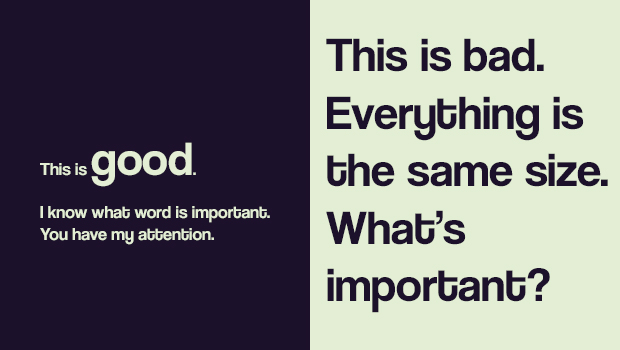
Size is a great organizational tool. Generally speaking, the bigger something is, the more important it is. With that in mind, there’s a little trick I like to do whenever I’m designing something:
Assign key information imaginary weights, with the most important items being the “heaviest.” Of course it varies from case to case, but usually you only need three weights (or font sizes)
1. Heading
2. Subheading
3. Regular copy
Now, I know. This all probably seems so obvious. You know what headlines are. You know to make things big when you want to get noticed. But here’s the thing…the inverse is also true. You can get attention with something small. It’s a rare and underutilized strategy, but it works. Consumers are savvy, wary of the dreaded fine print. Tiny text generally means there’s something unpleasant about the offer. Imagine defying their expectations with something pleasant? Or comedic? Give it a shot.
Think outside the box.
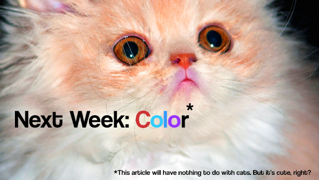
Next week we’ll take a look at color, why it’s the key to standing out, and why you don’t always want to.