Why Use Tangible Advertising In The Digital Age?

It seems like everything is going digital these days. Netflix replaced video rental stores, mp3s replaced records, and for many people, tablets and smartphones are replacing their daily newspaper. So why spend time and money designing physical promotional materials — like customized mugs, pens and magnets — when you could just send an e-mail at a fraction of the cost? Surely tangible advertising is outdated too, right?

Wrong. Today there’s a great opportunity for physical advertising, precisely because digital has become so popular.

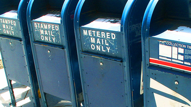
For one, home mailboxes aren’t as cluttered and bombarded like they used to be. Don’t get me wrong, consumers still aren’t interested in junk mail. But that’s the beauty of most tangible items: they’re not junk. They’re useful goods with a real purpose.

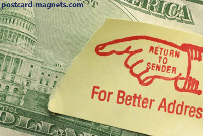
A well designed postcard with a magnet attached is more akin to receiving a small gift, instead of an inconvenience like most other forms of advertising. The perceived value is much higher, especially when compared to an e-mail. Everyone knows what an e-mail costs.

gift

Another postcard magnet advantage? E-mails aren’t a constant reminder. For most people, once they’ve read an e-mail (assuming they read it at all), that’s the end of that. They delete it, or it’s pushed down by waves of new e-mails, never to be seen again. With postcard magnets, your message is there to stay.

Once your magnet makes it onto the fridge or the filing cabinet, the odds are pretty good it’ll be there for a  long time. And if it’s there for a long time, it means your target audience is going to be exposed to your messaging over and over again. We know that on average, most people need to see a message six times before they feel compelled to act.

Do you think that’s going to happen digitally?


you can’t feel an e-mail.


Finally, when you’re considering what method of advertising to use, remember this: you can’t feel an e-mail. For many people, a tactile experience goes a long way towards creating a connection to whatever it is they’re trying to understand. By feeling something with weight and texture, the senses are activated in a way they simply wouldn’t be by merely looking at a screen. When the mind realizes something exists in the real world as an object, it suddenly gains more priority and importance.

These are just a few of the many ways time-tested postcard magnets can be superior to their digital counterparts.  How about you? What kind of advertising do you find yourself responding positively to? We’d love to hear your thoughts in the comments below.


5 Tips to Get Your Magnet on Their Fridge

By now I’m sure you’ve realized how awesome postcard magnet mailers are. They’re powerful promotional pieces with proven staying power, and the key to their effectiveness is their exposure rate. Once your potential client or customer makes the decision to use your magnet, they’ll be seeing your message often.  But how do you get them to make that initial leap? How do you get them to stick your magnet on a frequently visited sweet spot, such as the refrigerator or a filing cabinet?

Don’t worry. We have 5 helpful tips:

 What would YOU want on your fridge?

1. Be beautiful

I’m sure this one might seem obvious, but no one wants to put something ugly up on their fridge. If your magnet is poorly designed, cluttered, or if it features unpleasant imagery…guess what? It’s probably not going up. A well-designed magnet makes all the difference. Sometimes it helps to think of your magnet as art instead of advertising. What would YOU want on your fridge?

2. Be useful

If your magnet has information your customer perceives as valuable, they’ll want to keep it around. For example, magnets are a great option for Urgent Care offices because when a medical issue occurs, the last thing someone wants to do is extensive research. Likewise, if someone is getting ready to move, they’ll probably keep a moving company’s magnet around. A calendar of upcoming events is another great way to add some extra staying power to your magnet. People always appreciate convenient reminders.

3. Be relevant

Many people have a product that every household can use, but sometimes you’re selling something to a specific clientele. The beauty of mailing lists is that they can be incredibly focused. If you’re a moving company, you can get a list of people who have recently placed their home on the market. If you’re selling high end yachts, you can get a list of higher-income individuals. The possibilities are endless. The important thing is you’re getting your magnet into the hands of people who, well, could use what’s on your magnet.

4. Peel don’t seal

We’ve found the most successful magnet mailers are the ones that employ easy peel-off glue instead of plastic shrink wrap. Why? Well, for two very important reasons. First of all, in the past we’ve seen situations where the plastic shrink wrap fuses with the postcard, and when the recipient tries to remove it, it damages the magnet. Secondly, if the entire postcard is sealed in plastic, the recipient may not even realize there’s a magnet attached. Removing the plastic wrap is another step in the process, and the recipient might be inclined to just toss it in the wastebasket rather than deal with it. At magnetbyMail, we exclusively produce postcards with easy peel-off magnets for these reasons.

5. Size matters

Fridges and filing cabinets have limited real estate. You need to justify your magnet’s size. If you have a lot of important information you feel your customer needs to have access to at all times, such as a calendar of events or a big reminder of a specific date, a larger magnet makes sense. If all you need your customer to remember is your name and contact information, a business card sized magnet could be the more sensible approach.


And those are the 5 secret ingredients to great magnet mailers. Do you have any of your own tips? Or questions? Leave a comment, we’d love to hear from you.

Visual Hierarchy Lesson 4: Whip Your Designs Into Shape

In our fourth and final look at the visual hierarchy of design, we’ll be examining shape. Shape is a relatively intuitive concept because our minds are already trained to break things down to their most basic forms. Many of us grew up playing with blocks and other geometric toys, and we see shapes every day – from octagonal road signs, to square windows and doors. It’s this deeply ingrained familiarity that makes shape such a powerful component of design.

I’ve already discussed some of these concepts in the alignment section, but it’s worth repeating:

Diagonals tend to create a sense of movement and activity.

example1

…As do curvy unpredictable lines.

example-4

Continue reading

Visual Hierarchy Lesson 3: Here’s Some Straight Talk About Alignment

We’ve been talking about the visual hierarchy of design, and so far we’ve covered size and color. This week we’ll be looking at alignment. Alignment is essentially a method of arranging text or shapes in such a way that they’re aesthetically pleasing while also being easy to understand from an organizational standpoint. Imagine ten people standing in line. If someone stepped to the side, you’d notice them right away. The same rule applies to paragraphs. So far you’ve read several lines of text. If all of a sudden a line of text was centered…

You’d notice that line. It stands out.

That’s because humans like structure and stability, and almost everything in our daily lives reflects this. Our square houses are filled with box-like rooms. Our streets are made up of grids. Our newspapers are compromised of countless columns. We like square and rectangular shapes because they’re predictable and easy to understand. Straight lines tend to feel at rest, while squiggles and curves feel like they’re in motion. Continue reading

Visual Hierarchy Lesson 1: Why Does Size Matter?

The key to successful marketing is successful communication. Of course, the words and images you choose are important, but did you know how you display them is just as vital?

In a series of blog posts I’ll be exploring a concept known as the visual hierarchy. Simply put, it’s how we make people see what we want them to see, and in the order we want them to see it in. And we do this by understanding and applying the four main components: size, color, alignment, and shape.

it’s how we make people see what we want them to see, and in the order we want them to see it in.

Today we’ll be talking about size, the most frequently utilized and easiest to understand principle. Headlines in newspapers are a prime example. They’re big and designed to grab your attention. Think about the countless advertisements you’ve seen where FREE is the largest text on the page. There’s a reason for that… they know you’re going to see it, and with any luck, respond.

Continue reading

Embracing Weird: Advertising’s Shift To The Odd And Unusual

There’s a reason Super Bowl commercials are funny, and there’s a reason they cost millions of dollars: Witty works. Humor had long been an effective tool in an advertiser’s arsenal, and no matter how daring or risqué an ad was, it always had a concrete connection to the product or brand. The punchline was tied to the messaging. Now? Now things are starting to change.

If you’ve been watching television, reading magazines, or surfing the web, you may have noticed a trend – advertising is getting a little weird.

Old Spice ad

Okay, scratch that. Advertising is getting very weird.  But why?

Well first of all, advertisers are becoming aware of the power of social media and sharing. Viral is their new favorite word. And for good reason: a well-executed campaign can yield millions of impressions, now and for years to come, and at no additional cost.

However, execution is tricky because consumers are not easily tricked. They’re bombarded by advertising more than ever, and as a result they’ve developed natural defenses. They’re tuning out, changing channels, and filtering e-mails. If it smells like a pitch or looks like a promotion, their eyes glaze over and they look the other way.

It’s these factors that have created the perfect storm for the odd and unusual. Marketers are minimizing the what, as in what they’re selling, in favor of maximizing the what? As in what the heck was that, I have to show my friends. It’s hard to ignore the people that are important to us, which is precisely why advertisers are so keen on using them.


Burger King - The King

Remember The King? The creepy Burger King mascot that tormented us from 2004-2011? He was arguably the start of all this madness. And while creeping out your hungry customers hardly seems like the best idea, here’s the thing… it worked. People were talking about him, people dressed up like him for Halloween, The Simpsons spoofed him, and most importantly – Burger King profited.

He didn’t look like a fast-food ad. He wasn’t the perfect mouthwatering burger being grilled in slow motion, he wasn’t a waterfall of cola cascading over idyllic ice cubes, he wasn’t the imagery pretty much every other fast-food joint was using. He wasn’t a coupon or an offer. He was just…weird. The perfect thing for people to talk about around the water cooler without feeling like corporate shills. He was so intentionally disconnected from the product and typical messaging that Burger King was able to penetrate the average consumers’ defenses.

The creepy king was a carefully crafted promotional Trojan Horse.

And there’s countless examples of this strategy. Geico television commercials frequently feature short nonsensical skits that have next to nothing to do with their actual product. A pig at a football stadium? Really? GoDaddy has also switched from sexy and provocative to surreal and head scratching.

Geico Pig

Best of all, this approach isn’t limited to video. Print ads can be just as odd. The key is to be memorable, and to have your brand somewhere on the page or the screen so they’ll always associate your brand with that memory.  That’s it.


So as you develop your marketing strategy, consider doing something a little out there. No risk, no reward, right?


I’ll leave you with one of the strangest and most unnerving commercials I’ve ever seen. An advertisement for Totino’s Pizza Rolls that’s nearing 1,000,000 views. From mere word of mouth.

Do I want Totino’s after seeing that? I’m… I’m not sure. Am I ever going to forget the name?

Not a chance.

Urgent Care Marketing

Photo by Adam Ciesielsk

There’s a new business model that’s finding its way into almost every community: the walk-in urgent care clinic.

Today there are over 8700 urgent care centers in the US alone, according to the profession’s association.

And since urgent care clinics are usually small, local and privately owned, they are much more entrepreneurial than their big hospital counterparts.  Where a non-profit hospital might be able to get along with minimal outreach efforts, an urgent care clinic couldn’t survive if the community didn’t use its services.

For the doctors who run these centers, effective urgent care marketing can be the difference between withering or prospering.

As anyone who’s been involved with a neighborhood business knows, there’s a short list of effective ways to build awareness in a community.  But attending Rotary Club functions, co-sponsoring soccer car washes, and managing the chamber of commerce open house will only get you so far.

Sure, there’s something to be said for making an investment to assure a prominent spot in Google, under “local urgent care.”  But even the all-powerful Google Search would likely not connect with most potential patients when it was time for urgent care.

What the urgent care doctor needs is the clinic’s phone number, street address, and maybe a web address, to be posted in kitchens and workplaces throughout the community.

The clinic could really use imprinted magnets in those homes and offices.

And that’s where our postcard magnet mailers come in.

urgentcare-magnet-mailersYou see, our postcard magnet mailer is a jumbo, full-color, laminated postcard, with a magnet attached. We mail them to a mailing list you provide.

Think of it as a delivery-vehicle with a mini billboard that finds its way into the kitchen or workplace, for the cost of a postage stamp.

And done effectively, the magnet positions the urgent care clinic’s message in full view, for weeks, months or longer, for less than the price of an iced tea.

At magnetbyMail we handle the details: printing, laminating, assembling, addressing, bundling and even the postal paperwork.  We can even help with the design and the mailing list.

This leaves more time for the clinic to tend to its patients.

And even though we’re a bit biased about our love for these magnet mailers, we think you could might come to agree that it’s pretty much the vitamin C of direct mail marketing.


Another practical marketing idea from magnetbyMail.com,  where healthy results are what it’s all about.

USPS NCOA Requirement

Photography by Chris Woods

In return for the discount postage rates it offers for First Class Presort and Standard Mail services, the USPS requires that both of these types of mail meet its Move Update standards. This is also called the NCOA processing requirement.

USPS NCOA processingThe Postal Service maintains a sizable registry of people and organizations who have recently moved; and it compiles this info in its National Change of Address (NCOA) database. Mailings that meet the Move Update standard must be checked against the NCOA database, and updated for any address changes.

This is good for mailers, since it helps ensure that addresses are up-to-date. And it’s good for the Post Office, since it minimizes the expense of handling all those bad addresses.

The downside to the NCOA requirement is that it costs money. And for a small mailer with a small list, an NCOA processing fee can seem just plain silly.

Luckily, the USPS provides two ways to avoid the NCOA requirement: Continue reading

Improving Direct Mail

photo by Nick Bradsworth www.nbphotos.net/

OK, the secret is out: the most important factor in getting better direct mail results is improving the quality of your mailing list.

This may not seem that surprising. If you’re using really good criteria to select your mailing list, certainly you would expect improved results.

usps standardized addresses

But a quality mailing list is more than the criteria you use to create it. It is quality content in terms of accurate names and deliverable addresses.

At magnetbyMail, we see hundreds of mailing lists each year — most of them are created by our customers who send them to us. They are usually lists of alumnus, subscribers, members, prospects or clients.

And many of these lists are full of errors that would cause the Post Office all sorts of delivery problems.

Now, the good news is that we’ll do our best to make the addresses deliverable. We’ll try to normalize and validate each address provided, so that it meets US Postal standards and matches an address that really exists.

But (although we try) we can’t do miracles. If you manage a mailing list of any size, you should understand some things about Normalizing and Validating an address, to ensure that your list is in tip-top shape:

Normalizing an Address

The Post Office wants to see addresses in a certain, normalized way. They expect an address with at least three lines of information: 1) Recipient Line, 2) Delivery Line address and 3) Last Line. For example: Continue reading