We’ve been talking about the visual hierarchy of design, and so far we’ve covered size and color. This week we’ll be looking at alignment. Alignment is essentially a method of arranging text or shapes in such a way that they’re aesthetically pleasing while also being easy to understand from an organizational standpoint. Imagine ten people standing in line. If someone stepped to the side, you’d notice them right away. The same rule applies to paragraphs. So far you’ve read several lines of text. If all of a sudden a line of text was centered…
You’d notice that line. It stands out.
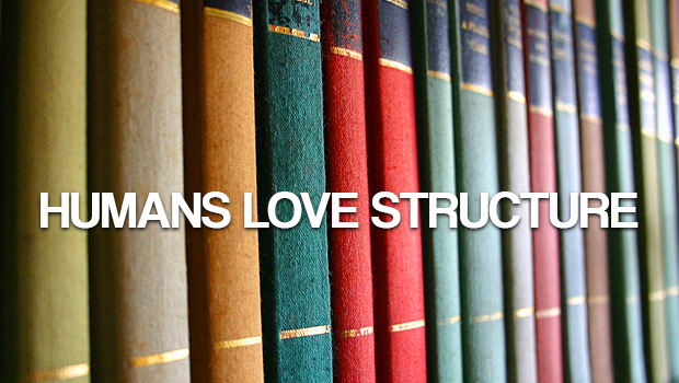
That’s because humans like structure and stability, and almost everything in our daily lives reflects this. Our square houses are filled with box-like rooms. Our streets are made up of grids. Our newspapers are compromised of countless columns. We like square and rectangular shapes because they’re predictable and easy to understand. Straight lines tend to feel at rest, while squiggles and curves feel like they’re in motion.
This isn’t to say you should avoid curves, diagonals, or more active shapes – you should just be aware of the message they send. There’s an implicit energy you can take advantage of, if you want the viewer to focus on particular elements. Even simply offsetting your paragraphs can help divide things into sections.
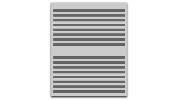
…But a document or a webpage that looked like the image above isn’t really ideal. It’s not exactly pleasing on the eyes, is it? It’s a wall of text. Before we even know what the content is, we’re passing judgement. It looks boring. It’s probably going to be hard to read. It’s impossible to tell what information is important.
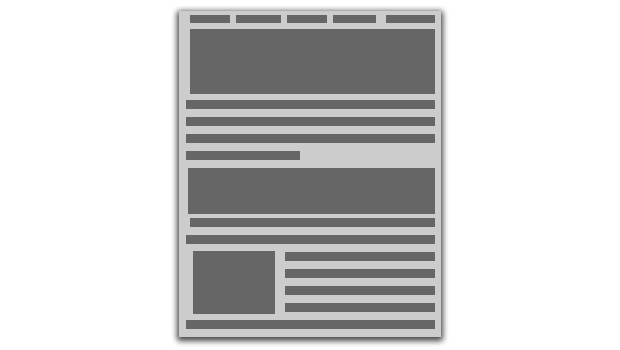
Now we’re talking. See how this one is already more inviting and interesting to look at? There’s not even actual content here, it’s just lines and squares representing text and images, but we get a sense that the information is divided and things are important based on their size and placement. It looks organized.
When you’re aligning text or images, really the only thing you need to ask yourself is should this stand out? Headers, lists, paragraphs, and large images are items that tend to benefit from being separated from general copy. But if you’re just writing a paragraph, you don’t want every sentence to be justified in a different direction. That becomes cumbersome.
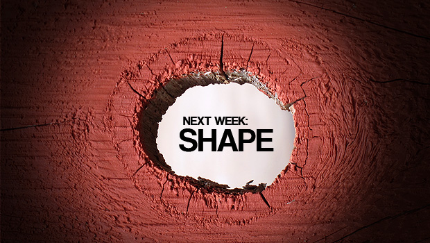
Next week is the fourth and final installment in our Visual Hierarchy series, and we’ll be looking at shape. The secret ingredient to a well-rounded design.